Notes for FIT5152: UI Design
首先在各种公开消息来源上都说这个是刷分水课来着。再加上本身自己在设计上想要有点提高(怎么说也算当过艺术生的),又经常有需要设计的场景(项目别太多)。现在也是前端更火热,所以掌握这个是很有价值的。
总算总结完了,感觉这门课可以改名叫UI Guidelines了……太tm多了这内容
S1 Introduction to HCI and User Interface Design
成吨的理论知识……后面几个S分别扩展
HCI,即人机交互,包含了为达成某目标的一系列行为
系统开发生命周期
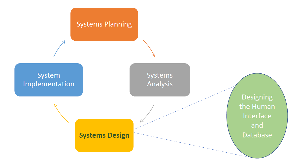
交互式系统设计
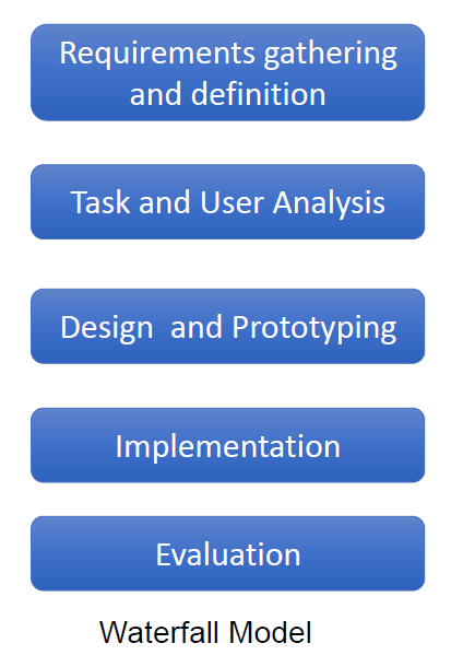
HCI主要的三个方面
- 我们如何设计?(谁是用户?哪些任务?)Design
- 我们如何构造?Prototyping
- 我们如何评估?Evaluation
Design:
获取数据及定义需求-> 用户分析,任务分析,环境/域分析,数据收集方式:采访,问卷,目标组或观察
Conceptual Design:
描述系统该做什么以及长啥样
Physical Design:
考虑系统实际细节
Prototyping
Assignment3的内容
Low-fidelity (paper) prototyping
High-fidelity (digital) prototyping
Native prototyping
Evaluation
Expert reviews专家审阅: Heuristics evaluation 启发式评估, Cognitive walkthrough 认知走查
Usability testing
Field studies
Observation
Usability
is a quality attribute of the UI
effectiveness, efficiency, and satisfaction in a specified context of use
Importance of UI Design
lead to user satisfaction, business success, and cost savings…
User-Centered Design
puts human needs, capabilities, and behavior first
match the needs and capabilities of the people
based on the needs and interests of the user
Users’ tasks and goals are the driving force
Why to involve users
- Users bring important knowledge of work tasks
- Designers can gain a better understanding of users’ needs and goals
- Greater acceptance of the system often results
- Fewer problems during development
- Lower maintenance costs over time
- Products that are easier to learn
- Reduction in errors
- Users develop a feeling of ownership through contributing to the development
Human-Centered Design
Human-centred design puts more emphasis on all stakeholders, and not just ‘users’
Principles of Human-Centered Design
The ISO standard describes 6 key principles.
These principles apply to user-centred design as well.
• The design is based upon an explicit understanding of users, tasks and environments
• Users are involved throughout entire development
• The design driven and refined by user-centered evaluation
• The process is iterative
• The design addresses the whole user experience
• The design team includes multidisciplinary skills and perspectives
S2 Everyday Design
实际上的标题是Design Theories, Models and Principles
Discoverability
Visibility
Visibility is not just about what you can see
Principles of Discoverability
- Affordances: 就像椅子、button一样一看就知道咋用
- Signifiers: 当affordance不能被察觉的时候拿来提示的(比如门上push, pull的贴纸
- Feedback: 反馈(比如震动
- Constraints: 约束,约束用户行为别乱搞乱用
- Mappings: 两类物品之间的映射关系(如音量±,还有插头插座
Conceptual model of the system
系统的理论模型
It provides understanding about the meaning of the controls and settings and what all that means
Users
尝试解释产品如何工作
在用户脑子里的叫mental models,通常根据experience, training or interaction with the product来形成
Designers
可能和用户的(mental models)不同
和用户的交流局限于系统印象
- the physical structure of the product, and the discoverability through using affordances, signifiers, constraints and mappings
- technical manuals and documentations
Knowledge in the head
the knowledge in the human memory system
requires learning
也可以把knowledge of the world然后转进head
Knowledge in the World
external knowledge
客观存在的知识
Much of the knowledge need to perform tasks can come from the information in the world (using affordances, signifiers, feedback and mappings)
比如键盘布局!
Cognitive Process
认知过程
include:
-
attention (the first step) can be visual or auditory, 就听or看见
-
perception and recognition, 洞察与辨别
-
memory, 记下来
-
Learning (and then reading, speaking and listening) 学习
-
reasoning and problem solving (reflective cognition) 推理与解决问题(反射式认知)
交互时涉及大量认知过程
Memory
the ability to store and remember information
Sensory memory
感官记忆,很短,且如果无意识就很快忘
Short-term (or working) memory (STM)
少量信息。短时间
接触新界面时候,会学习到新元素的使用,会存储这部分内容
好设计应当减少其发生(E.g. using ‘recognition rather than recall’)
Long-term memory (LTM)
retain the information for hours, months or years
无限容量
过去经历和知识的存储位置
形成了产品的mental model
Cognitive Load
认知负载。处理某任务所花费的气力
减少memory load就能减少cognitive load。这对好的界面设计非常关键
External Cognition
external representations and aids
应该最小化用户需要记忆的内容
通过外部认知能过减小load
– Externalising 外部化
• Transforming knowledge into external representations, e.g. using a calendar or diary (birthdays, appointments)
– Computational offloading 计算方面减负
• e.g. a calculator
– Annotating and cognitive tracing 注记或者认知追踪
• such as Word Track Changes
S3 Requirement Gathering, Task Analysis
Data gathering
首先需要收集 user, tasks, the context of use, the environment/domain and if any constraints
techniques
- Studying existing documentation
- Researching similar systems/products
就多看书or多抄
或者S1里Design里那些
KYC(Know your user)
一些重要指标
▪ Demographics: age, gender, occupation
▪ Needs, capabilities and limitations
▪ Digital literacy
▪ Cultural background
▪ Social status
Design Personas
Personas大致就是代表性用户画像的意思
Design personas: Focus more on user goals, needs, motivations, and user behaviour
Each persona usually have 2-4 goals
Goals are different from tasks, which are performed to achieve goals
Scenario: 场景, 就脑补(narrative叙述)一个persona通过交互实现goal的情形
Task Analysis
Hierarchical Task Analysis (HTA),就Assignment里画过的那东西。就尽可能分割任务然后用图表述。
S4 Navigation, Menus
Navigation
finding information by navigating through the interface
主要是解决fps游戏三大问
– Where am I? 我是谁
– What’s here? 这是哪
– Where can I go from here? 我该去哪
It requires understanding user needs and behaviour, identifying tasks, and effective content organisation
Structural Navigation
根据页面层级
-
顶级页面的主导航
-
次级页面里的二级导航
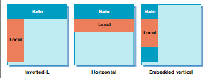
Associative Navigation
Associative navigation connects pages with similar topics and content or with the same level of importance without considering their location in the hierarchy
辅助性导航就属于是常驻的,不管页面层级
- Footer navigation
- quick links
- Contextual navigation
Contextual Navigation:
发生在内容上的导航
- Embedded navigation (e.g. Links within the text)
- Related links
- Usually provided at the end or to the side of page
- Adaptive navigation
- E.g. the links change based on what the site visitors do/select
Utility navigation
工具导航(不被包括进页面层级
– Navigation between pages and features that helps with using the interface
比如搜索栏
Visual Flow
扫描顺序为Z形,阅读顺序为F形
▪ Consider the logical flow of the users’ tasks.
▪ Create a logical path.
▪ Minimise eye movement.
▪ Use alignment and size uniformity for screen elements
。。。
S5 Form Design
Issues with Forms
可能存在问题:
▪ Too long
▪ Unclear purpose, asking for information that irrelevant to the user’s goals
▪ Poor information about the requirement of a given field,内容提示不足
▪ Asking for the same (or similar) information more than once,重复
▪ When there is an error, it does not clearly indicate where it happened or how it can be corrected,错误提示不足
▪ Not clarifying the right data format
▪ Not providing the necessary space,太窄
▪ Taking user control away,不自由
Data Quality Problem
就提交上来的数据存在的问题
▪ Data entered in the forms are often incomplete or have poor quality
▪ Well designed forms can improve data quality
▪ 目标:ensure correct data entry with minimal user effort
用户填表顺序
- Understanding the question
- Finding an answer
- Judging an answer
- Entering the answer on the form
Guidelines
!important 这东西重要
- Meaningful, familiar and standard field labels
- Consistent terminology and abbreviations
- Optional and required fields clearly marked
- Comprehensible instructions
- Use visible space and boundaries for data entry fields
- Differentiate grouped items
- Visually appealing layout (alignment)
- Use lists if possible to minimise errors
- Immediate feedback
- Completion feedback
S6 Evaluation
Evaluation and Usability Testing
Evaluation Aims
评估目标
- Are the options and controls visible to the user?
- Does the user know how to interact with the UI elements?
- Is the navigation and workflow appropriate?
- Does the product do what the user expected it to do?
- Is the functionality correct from the user’s perspective?
- What are the good and poor features?
作用
- Extensive testing is a key to successful design.
- To understand how real users use the product and if it meets their needs.
- To identify the issues and addressing them.
- To reduce user errors.
- To improve user experience and increase user satisfaction.
- To ensure the product meets the standards and guidelines.
- To compare with similar products.
- It is cheaper to fix a problem earlier in development than later.
Types
Experts:
- Cognitive walkthrough
- Heuristic evaluation
User:
- Usability Testing
- Field studies
- Thinking aloud
Expert reviews
专家审阅
identify usability problems and provide recommendations
早期或晚期
存在问题:
- Even knowledgeable experts might not know how real users, particularly first-time users, will interact with the product
- experts may not have an adequate understanding of the task domain or user communities.”
Cognitive Walkthrough
认知走查
用于设计早期
Heuristic Evaluation
启发式评估,,就assignment内容
– Nielsen’s 10 heuristics
– Shneiderman’s Eight Golden Rules
Nielsen’s 10 heuristics
- Visibility of system status
- Match between system and the real world
- User control and freedom
- Consistency and standards
- Error prevention
- Recognition rather than recall (menu: to underline text, you look at the menu and recognise the option)
- Flexibility and efficiency of use
- Aesthetic and minimalist design
- Help users recognize, diagnose, and recover from errors
- Help and documentation
Shneiderman’s Eight Golden Rules
- Strive for consistency (=N#4)
- Cater to universal usability (=N#4)
- Offer informative feedback (=N#9,)
- Design dialogs to yield closure
- Prevent errors
- Permit easy reversal of actions (undo)
- Support internal ‘locus of control’
- Reduce short term memory
S7 Prototyping
成功UI的四支柱Four pillars:
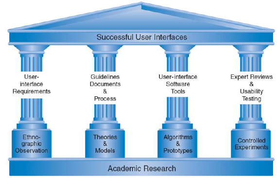
- User interface requirements
§ Right and complete requirements are key - Guidelines documents and processes
§ Design principles that must be adopted within the design - User-Interface software tools and prototyping
§ To give users a clearer idea of design and its implications - Expert reviews and usability testing
§ To evaluate the design
Prototyping
重要性
– test their ideas,
– test possible alternatives,
– clarify requirements,
– validate requirements,
– solicit feedback
– identify problems
– and improve the final product
类别
Level of fidelity:
§ Low-fidelity prototypes
§ High-fidelity prototypes
Type of medium used:
§ Sketching and paper prototypes
§ Digital prototypes
§ Native prototypes
Level of interactivity:
§ Static prototypes
§ Interactive prototypes
Level of detail:
§ Horizontal prototypes
§ Vertical prototypes
low fidelity
adv
• Simple, cheap and quick to create.
• Truly hands-on because the designers have to manually manipulate the content.
• The process of cutting, pasting, sorting, labelling forces designers to become familiar with the content elements.
• It can be constructed quickly and efficiently and taken anywhere.
• Even in a rough form, it gives the users a good idea of content organisation and navigation.
• Easy to refine in the final product.
• Prototypes appear to enhance teambuilding skills.
• With low-fidelity prototypes, users and designers are often more willing to suggest changes.
• Users are more comfortable working with paper and criticising it rather than the real system.
• Users recognise it as a ‘prototype’ so feel more free to make recommendations.
• It allows for more iterations.
• It allows to test with more users and identify more problems.
High-Fidelity
adv
• Interactive
• Enables testing navigation, graphical elements and colours, legibility, image quality, alignment and spacing.
• Looks and works more like the real product, resulting in more useful feedback.
• Designers can show and test real flow and interactions.
• At this stage certain limitations become apparent that were not identified earlier in the design.
disadv
• It is not as cheap as low-fidelity prototypes.
• It is not as fast as low-fidelity prototypes.
• It cannot be taken anywhere easily like low-fidelity prototypes.
• It cannot be refined as easy as low-fidelity prototypes.
S8 UI Design and Usability - Graphics and Visual Design
Visual Design
视觉设计
▪ Line
▪ Shape
▪ Size and volume
▪ Position
▪ Negative/white space
▪ Colour
▪ Basic visual elements are used to create text, images, icons, textures, and animation
【感觉就像SVG
Color
Guidelines
• Select colors carefully
• Minimize number of colors
• Reduce eye strain instead of increasing it
• Follow conventions: e.g. link colors
• Be aware of accessibility rules
– Be aware of color blindness
– Provide sufficient contrast between foreground and background
– Don’t use color alone to convey information
Typography
Guidelines
• Use more legible fonts
• Use fewer typefaces (generally 1-2, or 3 max)
• Italics, underline and bold can be used to emphasise points but should be used sparingly
– Underlines can be mistaken by hyperlinks
• Minimise using different sizes (1-3 max)
• Support redundancy
• There should be sufficient spacing between text lines to make it easy to read, and to increase reading speed
• The size of the font should be large enough
• The text alignment is also important and better to use left or justified alignment because the centre or right alignments make the text hard to read
S9 UI Design and Usability - Interaction Styles
交互风格
Command Line Interfaces
没错命令行也是……
disadv
- Commands are issued in a specific language and different across different platforms.
- Hard to remember the name of commands and their order (specially for novice users).
- Hard to provide users with feedback and handle errors.
adv
- It is more efficient to use by expert users.
- It is more efficient to perform repetitive tasks.
- Lack of graphical UI elements allows the user to focus on the task.
Direct Manipulation
直接操作
其实就是UI点点点这样的
。。。
Fitts’s Law
建议移动到目标区域所需的时间是考虑到目标的距离以及目标的宽度/大小的函数
它是一种预测模型,可用于确定UI元素(如按钮)的正确大小和正确位置


Hick’s Law
用户做出决定所需的时间取决于可能的选择数量
菜单中包含的选择越多,用户做出决定所花费的时间就越长
不确定和不熟悉会增加决策时间
KISS(保持简短和简单)
使用带有较长列表和菜单的图像会很有帮助,并且可以将用户快速定向到正确的内容
Choice
如何选择交互风格
- Selecting the right input and output devices depends on: 选io设备根据
- Environment and context of use 使用环境
- Speed of interaction (Games) 交互速度
- Accuracy of actions 准确度
- Type of tasks (if it requires entering a large amount of text) 任务类型
- Size (of screen) 屏幕大小
- Complexity of the system 系统复杂度
- Users?
- People with disabilities 残障人士
- Their digital skills 用户电子水平
- Their previous experience with the device 用户对设备的使用经历
The most important thing is to meet the users’ goals but user preferences vary.
Interfaces change but principles do not(所以考guidelines)
S10 Design Styles
UI Design and Usability - Design Languages and Styles
设计语言(也就御三家的玩意……
– Skeuomorphic Design(老罗最爱拟物设计)
– Flat Design (扁平化)
– Metro Design (MDL), MDL2 (时代眼泪), and Fluent Design (微软biss)
– Material Design (好家伙)
– iOS Design(好看+流畅)
S11 Reports & Error Messages
UI Design and Usability Reports - Error Messages
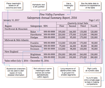
Report Guidelines
- Use meaningful titles of the report.
- Include meaningful information.
- Balance the layout. 框架平衡
- Design an easy navigation system for a multi-page report.
- All important information should be highlighted. 高亮关键内容
- For displaying text in a report, 文字
- use mixed uppercase and lowercase.
- void using overly fancy fonts
- use enough spacing between paragraphs.
- left-justify text and leave a ragged right margin.
- use abbreviations and acronyms only when they are widely understood and are significantly shorter than full-text.
- For displaying content in tables and lists in a report 表格/列表
- all columns and/or rows should have meaningful labels 都要有标签
- labels should be separated from other content by using highlighting 标签从内容里拎出来且高亮
- redisplay labels when the data extend beyond a single screen or page. 别超出屏幕
- sort in a meaningful order 排序
- avoid using overly fancy fonts 别用浮夸字体
- right-justify numeric data 数字数据右对齐
- left-justify textual data. 文字数据左对齐
- break long sequence of alphanumeric data into small groups of 3 to 4 characters each.用符号分割长数字
-
- For displaying data with visuals, use the right type of visual with the data in the report to turn report data into knowledge.
- Use line graph to track changes over a period of time
- Use bar graph when comparing things between different groups or when tracking changes over a period of time
- Use pie chart when comparing different parts of a whole.
- If there is a lot of data to display in a report that requires scrolling, apply filters and make use of hierarchies/drill-downs.
Error Message
- Be as specific and precise as possible. 尽可能精确详细
- Choose user-centred phrasing. State problem, cause, and solution. 向用户表述问题,原因以及解决方案
- Consider multiple levels of messages. 考虑多级消息
- Use a positive tone. Be courteous. Avoid condemnation. 用积极语气,别骂人
- Maintain consistent grammatical forms, terminology, and abbreviations. 用一致的格式术语缩写
- Keep error messages next to fields in forms. 将错误消息保留在表单中的字段旁边
- Use color to differentiate errors from normal field states 用颜色区分
- Add iconography or subtle animation for easy scanning 加icon或动画方便发现
- Maintain consistent visual format and placement. 保持一致的视觉格式和位置
- Use modal dialogs for important warnings to prevent or correct critical errors 使用对话框显示重要警告,以防止或纠正严重错误
- Use modal dialogs only when there is a need to draw extra attention to an error that can lead to some irreparable consequences. 仅当需要特别注意可能导致某些无法弥补的后果的错误时,才使用对话框。
- Modal dialog boxes are disruptive as they disable the main content and do not allow the user to continue interacting with the interface until the dialog box is open, thereby, interrupting the user from completing their task. 模态对话框具有破坏性,因为它们禁用了主要内容,并且在对话框打开之前不允许用户继续与界面进行交互,从而中断了用户完成其任务。
S12 CURRENT TRENDS IN HCI
略